Web marketing starts with a visitor-friendly website.
For most businesses, the ultimate purpose of web design is to encourage a visitor to become a customer. To achieve that goal, websites need to be visitor-focused. Every decision about the website should answer the question, “Will this be better or worse for the visitor?”
One person needs to be responsible for the outcome of the design, and that person needs to be visitor-focused (not CEO-focused or sales-department-focused or technology-focused). There is a snide response to the adage that a symphony can’t be played by just one person: No committee ever wrote a beautiful symphony.
Just like a composer learns music theory to help his symphony achieve his vision, web designers should use the body of knowledge we have concerning good design to meet your company’s goals. This article will discuss some of these essential principles.
As I wrote week, good design is passionate and purposeful. We have established that the purpose of website design for businesses is to encourage visitors to become customers. (We’ll visit how to grow the number of visitors to your site in a future article).
 Donald Norman wrote The Design of Everyday Things
 in the 1980s. The book is so brilliant that his design concepts remain crucially important and can be applied to website design today. He writes,
“Design should… make sure that:
- The user can figure out what to do, and
- The user can tell what is going on.”1
For example, if your website visitor wants to send you an email, you should make it easy for her. If your website is trying to load content for her to view, she should be able to tell what is happening.
“Okay, but how can I make things easy for my visitors?”
Design your website to behave in ways they expect and are comfortable with. Through research, we know the most viewed spot of your website is the top left corner. You can use this area to tell visitors who you are and what you do. Typically, visitors expect to see a “Contact” link on the right side of the top navigation bar.
Your website should be designed to allow visitors to use their web-browsing habits to discover content on your website. Visitors refuse to learn a whole new way of browsing just to use your website. In his book Habit: The 95% of Behavior Marketers Ignore, Neale Martin makes a compelling case that most human behavior is driven by habits, and if a habit is broken, a person will experience a feeling of dissonance.2 For something as basic as finding the FAQ’s on your website, a visitor should never feel dissonance.
Visitors also hate to be annoyed. Many companies, in an effort to help visitors learn as much as possible, will have every link open in a new window. After closing a dozen open windows, what the visitor really learns is to never visit that site again. A good rule of thumb is to have links referring to your own site open in the same window, and links referring to outside sites open in new windows.
We can please a visitor’s sense of habit by following more advice from Donald Norman. He advocates making the most common things visible, using “natural mappings” and giving the user feedback.3
Make Things Visible
Don’t hide the most important information in menus on your website. If you want visitors to contact you, put your contact information on the home page. This is a very easy-to-understand principle that just as easily gets suppressed through design-by-committee antics.
Use Natural Mappings
Norman writes, “Mapping is a technical term meaning the relationship between two things, in this case, between the controls and their movements and the results in the world”4 In other words, if you want your car to turn right, you turn the wheel to the right. Unnatural mapping explains why so many drivers find it difficult to turn while backing up; you have to turn the wheel the opposite of the way you want to go.
Mappings are especially important on websites because everything on computers is virtual, not tactile. For example, if you have a slideshow on your website, make sure it behaves as quickly and naturally as flipping a page in a magazine.
 |
|---|
Give Feedback
A visitor won’t know they have completed a task successfully unless you tell them. So, if they fill out a web form, direct their browser to a thank-you page. If they sign up for your newsletter or buy a product from your site, let them know it was successful.
There’s no need for fancy animations that take time to load. Visitors won’t stick around to see them. The average visitor will give your website one second to start loading before moving on to the next search result. If it takes longer than ten seconds to load, no one will wait for it.
For more detail on these aspects of design, read the first chapter of The Design of Everyday Things (or even better, read the entire book).
Website Design Examples
The best way to experience the importance of website design essentials is to visit good and bad websites. As you visit the links, ask yourself the following questions:
| What does this company do? |
|---|
| How would I contact this company? |
| How would I log into this site? |
| Is it pleasant to visit this website? |
We’ll start with the bad websites.
If you can endure the rousing repetition of the “William Tell Overture,” this angelfire.com site is a great example of design gone horribly awry. Fortunately, it was intentional. Unfortunately for the rest of these companies, their website design was intended to attract visitors. Poorly designed websites can be found in all business sectors. Procter & Gamble is a global company, with a large marketing budget. It doesn’t matter how much money you invest in a website if you don’t design for your visitors.
 |
|
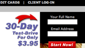 |
Web Marketing Magic |
 |
Procter & Gamble |
 |
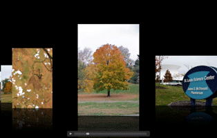
Coastal Heritage Society |
Now for the well-designed websites.
Ask yourself the same questions as you visit these well-designed websites. None of them are perfect, but they are all visitor-focused.
 |
Apple
Shows good navigation bar design. |
 |
Google
Makes searching, the most important task, prominent |
 |
Peter Yastrow’s Blog
Lets the visitor know what Peter Yastrow writes about. |
 |
Overnight Prints
Easy-to-find contact info and prominent special offers. |
Decide for yourself if the following sites are well designed or not. I’d like your opinion. Leave a comment or email me at amanda@zooinajungle.com with your feedback.

")

Hey great blog! It helped me so much!
Thank You very much!
Kind regards
[Reply]
Search engine result advert expert Themelis Cuiper had a bookmark to your internet site. Any idea why? Mobile + social media marketing high priests do not recommend something without a reason. 😎
[Reply]